Coco Gauff Is Playing for Herself Now
18 MIN READ
At 20, the defending U.S. Open champion is moving into a new phase of her career
At 20, the defending U.S. Open champion is moving into a new phase of her career


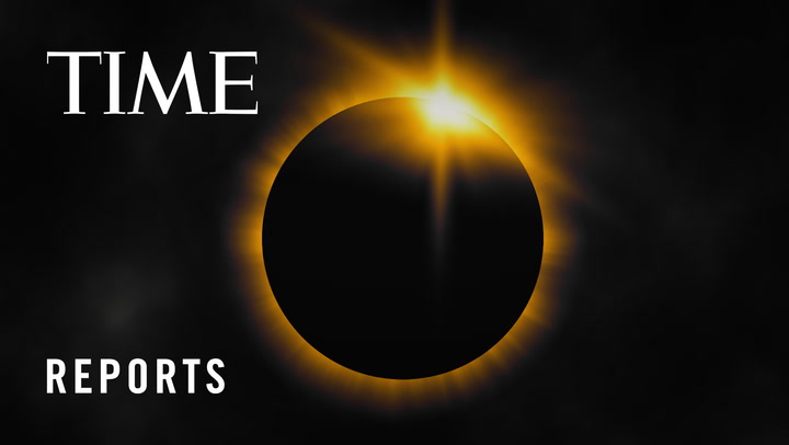
A rare total solar eclipse will occur across Mexico, the U.S., and Canada on April 8, 2024, when the moon will pass between the Earth and the Sun, blocking the sun’s rays during the day time, causing a temporary period of darkness. TIME Editor-at-Large Jeffrey Kluger explains the best way to experience it.


Subscribe now to get unlimited access to TIME.com and more!


Designer and TIME Earth Award honoree Gabriela Hearst touched on clean energy and how she tries to be a “catalyst” for the next generation of leaders.


The judge overseeing the former president's criminal trial is familiar with his history, in and out of court.


Comedians Phoebe Robinson and Alex Edelman spoke about the power of laughter at the TIME100 Summit


New research about incentives, collaboration, and connection.