


Subscribe now to get unlimited access to TIME.com and more!
- 2024 Digital Magazine
- Inside TIME Newsletter, emailed twice weekly
- Discounts at the TIME Cover Store


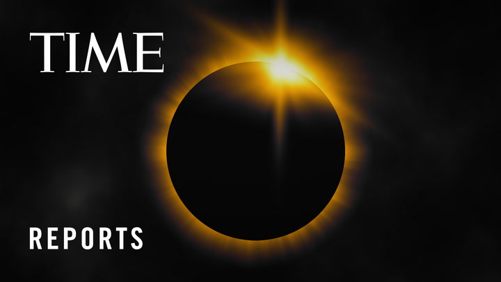
A rare total solar eclipse will occur across Mexico, the U.S., and Canada on April 8, 2024, when the moon will pass between the Earth and the Sun, blocking the sun’s rays during the day time, causing a temporary period of darkness. TIME Editor-at-Large Jeffrey Kluger explains the best way to experience it.


Subscribe now to get unlimited access to TIME.com and more!


The European Court of Human Rights ruled that its member nations must protect their citizens from the consequences of climate change.


Trump could regain enormous power over the country’s universities. His agenda includes ideas that higher ed is already bracing against.


New research about incentives, collaboration, and connection.